Undisclosed client. NDA restricts use of the company name and logo.
UI/UX
Prototyping
Tablet App

ABA practice management tools serve two very different user types: clinicians running therapy sessions and administrators handling scheduling, billing, and reporting. Designing for both in one product means constant tension between clinical depth and operational simplicity. This client had a SaaS product already built out, but the usability and asthetics were in need of a refresh.
industry
Mental Health / Wellness
project type
B2B / Refresh
role
Lead Designer - Barrel Proof Apps
focus area
UI/UX, Protyping, Tablet app
The Brief
Request
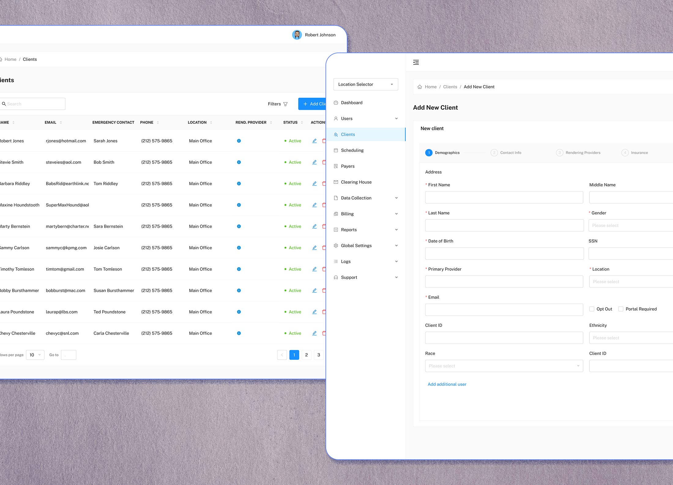
This project came in as a reskin request for the web app, and a ground-up build for the native app. The web app was functional, but built with a developer-lead team. Meaning, it needed attention to the user flows and information architecture. Core features were there, but they were burried in multiple clicks and the overall experience felt a little clunky. Especialy when compared to other tools in the behavioral health space. The mobile app also existed, but was missing key functionality from the web version and wasn't optimized for tablet viewing. I pushed back on the reskin framing early and made the case for rethinking the IA and user flows before touching the visual design. The CEO agreed, and the scope expanded from there. I worked solo on all of the UI/UX designs, meeting twice a week with the CEO and a product manager to ask questions, walk through the existing app, and review design changes.
Deliverable
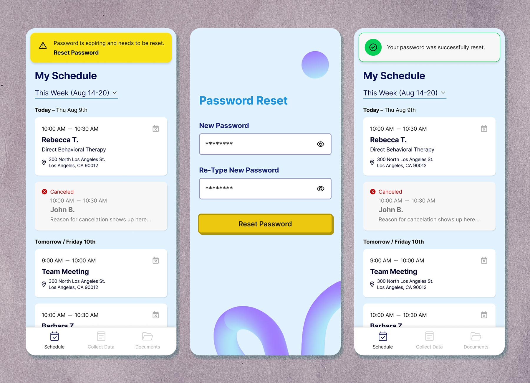
A full UI and UX redesign of both the web and mobile apps, a restructured information architecture, and a new tablet-optimized app for in-session therapist use. Wireframes and final UI were delivered for both platforms. A template was purchased beforehand for the web app, but after further inspection, it wouldn't suit our needs. Wanting to ease the burden on the development team and stick with a template, I researched other templates and selected one that worked within our IA structure and final vision for the product. The tablet app was designed from scratch.

How the web and mobile apps looked beforehand.

Information architecture with a before and after view of the main and sub navigation.
Approach
After familiarizing myself with the product and the user intent, an information architecture audit was the first step. I mapped the existing navigation, flagged structural problems, and then provided proposed solutions. The simple act of stripping the 'Manage' prefix from nav items seems like an insignificant change, but it immediately made the sidebar more scannable. Next was reorganizing the navigation order by frequency of use and moving key actions like adding a new user to modals and inline flows reduced the number of steps for the most common tasks. The new patient onboarding flow was the most complex UX challenge. Five screens with a high number of inputs, used by clinicians who are often context-switching between administrative tasks and patient care. I restructured the field order and introduced progressive disclosure, so inputs only appeared when contextually relevant, reducing cognitive load without removing anything required. The tablet app required a different mindset. Therapists will use this during live sessions with young patients, so speed and minimal friction were the top priority. I designed the measurement tools, behavior logging, frequency tracking, and duration recording to be accessible in as few taps as possible. The constraint of in-session use shaped all interaction decisions.


Outcome
The redesigned web and mobile apps shipped with incremental rollout to avoid disrupting existing users, a common constraint in live SaaS products with an active client base. The project wrapped when I transitioned to a full-time role, but I was brought back after a colleague covered ongoing updates for a period. A client coming back is a good sign that the initial work was well received.